Thursday, November 17, 2011

Drinking Problems:
The Making of a Silent Short-Film

I'm so proud of this movie. Words can barely describe how wonderful I feel that I helped to make this movie possible. Of course my brother Adam can take the lion's share of the credit; it was his idea after all, he made it possible.

I've never met another thirteen-year old boy who admired the work of Charlie Chaplin so much that he wanted to pay tribute to him in the form of an original black-and-white short-film, yet that's just the kind of guy my brother is.

Origins:

The idea for this film had been simmering in his mind for a long time now, and every so often he used to bug Bettina and me about making it. "Can we do it today? How about tomorrow? Next weekend?" I thought it was cute that he wanted to be make movies again, like we used to do with our "Leslie & Kyle" sock-puppet videos, but for me those days were long gone. We had other, better things to do, like watch other people's internet videos. =p

Production:

Finally my sister and I gave in, and we drove ourselves and Adam to our nearby park to start shooting. We only spent about a half-hour there, due to loss of daylight (it was around sunset at the time), but we had all the footage we would need. A few hours cutting and rearranging video-clips in Adobe Premiere Pro later and it was practically done. The music came last of all, believe it or not. As soon as we played the video along to "Maple Leaf Rag", we all knew it was a perfect match.

What's next?

Hard to say really. After putting the video up on YouTube and sharing it on Facebook, the apparent lack of response seems like an anticlimactic end to this story, though who knows? Perhaps with time will come recognition. All I know for sure is from now on I'll never get that music out of my head, nor will I ever want to. The more I watch the final product of me and my siblings' teamwork, the more I love it.

I hope that whoever reads this will love it too and share this video with anyone who needs a good-natured laugh.

Tuesday, September 27, 2011

5 Awesome Sites for the Graphic Designer

For this post, instead of show-casing works of my own creation as I normally do, I'd like to take some time to share some useful, compelling, beautiful, and totally tubular websites that have helped to inspire me in the field of Graphic/Web Design. In alphabetical order, here are five sites that you should totally check out if you're a wanna-be, beginner, intermediate, or even a professional designer:
Color Scheme Designer

Want to create killer color combinations? Piece of cake! Just play around with this baby and you're sure to find something you like. This web-application even shows you how your color scheme would appear to color-blind people. How cool is that?
Create a Favicon

You know those tiny icons you see in the top of your browser window, in your tabs, in your browser's bookmarks area, or on the tiles of your tool-bar? Those, my friends, are "favicons" (just in case you didn't know). Favicons are very useful for identifying websites from one another and making them easier to remember. With this tool, you can whip up a favicon in no time by either uploading a photo or drawing a 16x16 pixel icon from scratch and then downloading a miniscule file for including in your web-pages.
CSS-Tricks

This resource is excellent for people who really want to go the extra-mile when it comes to CSS. It's got it all: articles, forums, download-ables, video-tutorials, even handy snippets that you can copy-and-paste. Not to mention that the website itself is the very model of Web 2.0 design. Browse through it and you're sure to find something useful.
Nice and Free CSS Templates


What you see is what you get. Click on any one of the 12 solid, simple starting points for a website layout and you get the HTML and CSS code that you need to make it appear. The website itself may not be loaded with the latest content, but it has all that it needs to be a great tool for web-designers and developers alike.
Psdtuts+

This is for all you Adobe Photoshop users out there. If you're anything like me, you know that the way to stay ahead in the game is to keep learning. With this site, artists of all levels can gain valuable tips, tricks, shortcuts, and new skills from following the step-by-step tutorials and videos. Even if you're a first-time Photoshop user who doesn't know the difference between Filters and Layer-Effects, there is definitely something for everyone.

Monday, September 12, 2011

Chobits Characters!

Hello! Or as the Japanese say, "Konitchiwa!"

Lately I have been inspired from reading some excellent manga series to practice my figure drawing skills.
How is it that the Japanese-style method of drawing the human form has become so prevalent? It's amazing how cartoony, and yet how real characters can look when drawn manga-style, isn't it?
Here's a picture of my most recent sketches, my favorite characters from the manga/anime series "Chobits".

The basic premise of the story is that it takes place in an alternate universe where computers are so advanced they can be made to look like actual people, and Hideki, a 19-year-old student who's almost broke, happens to find one of these "computer-people" lying in the trash. The "persa-com" (as they are called in-universe) is shaped like a beautiful girl, and Hideki names her "Chi", because at first that's the only word she knows.
Eventually Kideki teaches Chi more and more about the world, and he discovers that Chi might actually be a "Chobit", an artificial-intelligence with the ability to learn and think for itself.

The other character shown in my drawing is a "laptop" named Plum. In the story she's about the size of a doll. She is the most adorable thing I've ever seen! ^_^

I hope my drawings have piqued your interest enough to get you curious about this awesome series. Fair warning: it's got a bit of mature, sexy content, but then again, what good manga/anime series doesn't?

Wednesday, August 24, 2011

Toastmaster Doodles

Last Monday, I was a guest at my mom's Toastmasters meeting. Currently she belongs to a different club than Bettina and me. From time to time, just to mix it up a little, we visit her club, and it's always a pleasure to meet her fellow members and hear some interesting speeches. This particular night however, not only did I watch my mom deliver her 4th speech (so proud of her by the way ^_^), I also did a few random doodles on my agenda handout. Take a look here.
First, the unaltered paper:

Now, the be-doodled one with lots of random, cutesy pictures. Don't ask me why they're there.


From top to bottom, let's see what we have here:
shy bunny thinking about a carrot,
a computer that says "HI",
striped cat thinking about an empty bird-cage (with the bird himself actually perching on the kitty's tail),
a tall tree thin enough to fit in the left-margin,
random flight of stairs,
bouncing ball flying over a dude with a see-thru skull,
an elephant on a diet (my brother Adam had such a funny look when I told him that's what it was),
pretty non-assuming little flower,
part of the Toastmaster's logo itself (compare to the picture in this link: TM Logo.jpg) with a plane flying around it (in outer-space o.O),
hand and pen,
dwarf-type guy peering over "The Mission of Our Club",
something that vaguely looks like a air-field wind-sock or something,
a flock of birds sitting on the wire,
a shiny medal near the "awards" section,
a black cat looking up at a cockatoo parrot,
the "M&Ms" logo (had a pack of them during the meeting),
a roughly drawn woman,
a stork,
a scary mask,
well-drawn guy in glasses,
and finally...one of the speakers themselves
Everything was drawn with a thin, black, Crayola marker that I found in a big marker bin. What fun they were to do. Hope you like them.

As a bonus, here is a neat animated-GIF morphing-trick I learned in Adobe Fireworks. Enjoy!


Sunday, August 7, 2011

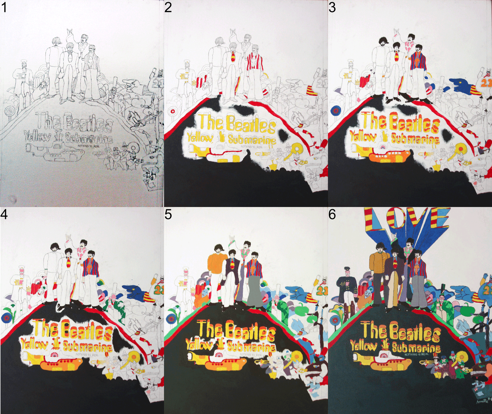
"Yellow Submarine"
Plus: Animated Progression GIF

This week, I've been working on something very special and dear to my heart: the album cover of the Beatles' "Yellow Submarine".

Why is this picture so special? Let me put it to you this way: the animated movie "Yellow Submarine" was one of those movies that defined my childhood. I loved it. As a kid, my sister and I would watch over and over and over again.
To this day, we can still recite whole scenes from the movie by heart. Don't even get me started!

My dad is a HUGE Beatles fan (having lived through the 60's and all that), so in our family, Beatles music was always playing, always present, always fun to sing and dance along to. I created this so I could express the joy that this colorful, wacky movie and album gave (and continues to give) me.

Notice the word "LOVE" in proud red/yellow stripes coming out the top? That part's not on the original image! It adds a nice personal touch, plus it pretty much summarizes the whole message of Beatles' music in general.


As a bonus, here's an animated-gif I created so you guys can see how my painting progressed from pencil drawing to finished masterpiece without having to scroll another inch! Ta-da!

Sunday, July 31, 2011

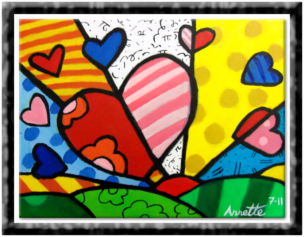
Hearts Rising

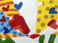
This work, I think, falls under the mixed-media category. It started out as an acrylics painting (referenced in my "Autumn Aspens" art-post), but then I finished it up using oils. Better than doing it the other way round, let me tell you.

I based this painting on a work by an artist named Romero Britto called "A New Day". Hopefully, my work is different enough that it doesn't look like an identical copy of Britto's painting.

Saturday, July 30, 2011

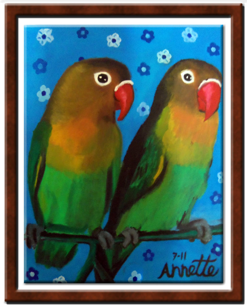
Lovebirds in Oils


Believe it or not, this is my first ever oils painting. If you happen to be curious why my signature is so big, the reason I made it like that is I remember hearing somewhere that Vincent Van Gogh, when signing his paintings, would make his signature small if he wasn't particularly proud of the painting, and large if he was very proud of it. By this logic you can see how proud I am of my work. ^_^

I love the colors on these birds in real life. It's as if nature itself took a paint-brush and went all out on them! What a treat to recreate them for myself.

(Edit:)
After uploading this to my DeviantArt gallery (which you can visit at this link: Cartoonconnoisseur's Gallery), I got a positive comment on it just 1 minute later! How about that? Instant art-fan, just add art! ^__^

Monday, June 20, 2011

"Autumn Aspens"/Last Acrylics Class

Week 5 of Acrylics Class:
Had an absolutely lovely painting session. I continued the painting I started on week 4: a forest of aspens in the autumn. Here's what it looked like at the end of class 4 (the day I brought home my lighthouse painting).
As you can see, all I did was block in the background colors and draw the outlines for the future trees. On week 5, I had so much fun, because I got a lot of work done, and the whole time Jan had beautiful traditional South-American music playing as we painted. I've never been to South America, and the music is so haunting and magical it makes me "want to go to there"! ( ^_^ Tina Fey quote.)
On the left is how my painting looked by the end of class 5, and on the right is how my palette looked after class 5. A fellow student suggested that my palette looked almost as pretty as my painting, so I took a picture for good measure. I rushed a bit towards the end, and I really hoped to bring it home. Jan, in her infinite wisdom, instead convinced me to wait until next week (after adding more depth, shadow, and detail) to bring it home.

Week 6 of Acrylics Class:
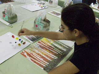
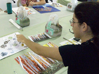
On the day of my final acrylics class, my mom came with me. Just like my brother and sister 2 weeks ago, she got to see the gallery, meet my teacher and class-mates, and hang around listening to the music and watching me paint. Additionally, she shot some photos of me finishing my painting IN ACTION!
(As much action as you can get when you're painting acrylics, anyway.)
Dotting the trees...
More paint, please. ^_^
...more paint please...
I'm having the best time...
Using the palette knife.
Here I'm using a palette knife.
It's not as easy as it looks, but with practice, everything gets easier.
Painting with a palette knife is not as easy as it looks, but with practice it becomes less of a challenge.
Time to sign my name on it!
I can sign my name to that!
Close up of my "sig"...
After I finished, I still had about half an hour left, so Jan said I could start another painting. She gave me a Romero Britto painting called "A New Day". Though the picture seems very simplistic and much easier than the ones I've already done, it's no less of a task to start it than the others. And wouldn't you know it, I wasn't able to finish it in time. Jan suggested I take it anyway along with the one I finished, and get myself some acrylics to finish it up at home.


Before my mom and I left, I asked Jan if I could take a picture with her, and she said okay. Isn't she the sweetest? I hope I never forget her.

Thank you very much Jan, if you ever read this, for all your help and for giving me so much confidence in my own creativity. You made me feel welcome, and that is all it takes sometimes.

Monday, June 6, 2011

"Lighthouse on the Sea" / Worth the Wait

Hi everyone! Since my initial blog-post about my first acrylics masterpiece, I've had a couple more classes that have humbled me up good and proper. Before, I thought that every week I'd bring home another new work of art to show everyone and I'd get that magnificent high of praise and positive feed-back that is craved by all people. Here's what really happened:

Week 2 of Acrylics Class:
Teacher Jan gives me a choice as to what my next subject will be. She gives me a few different photos, and I choose a pretty one with a lighthouse on a hill by the sea. I get right to work. 2 hours goes by in a snap! This is what I have produced by the time I have to go.
Believe it or not, this was not finished. I still had to do the proper layering, shadowing and highlighting of the rocks on the cliff and on the path, plus refine the houses in the distance. Jan promised me that I could leave my painting safe in her gallery for the week and I would come back to finish it next time.

I've seen the other students leave their work with her before, so I thought, okay then. When I got back home, my family was excited to see what I brought home, but they understood when I told them I wasn't finished with my latest work yet. My dad suggested next time to bring a camera with me so that I could at least show my work in progress.

Indeed, it is a great idea, and that's how I'm able to show you the unfinished product at all!

Week 3 of Acrylics Class:
I'm excited, I'm pumped, I'm ready to finish my painting and bring it home. At first, it is strange to begin with an already-started work, and I don't know how to approach the canvas confidently. Jan gives me good suggestions on what to work on and what tools are best for the job.

This week I was also introduced to this special stuff called artist's texturing gel. You mix it in with the paint and you're able to add a popping-out textured effect to a painting, creating the illusion of clouds, water, grass, tree-bark, etc...

I applied the paint straight on with a palette-knife instead of a paint-brush. Usually I use the knife just for mixing colors, so it felt very strange using it on canvas. I remember feeling very frustrated at times, especially when trying to paint the rocks and stuff.
Again, 2 hours went by, and I still was not done. I hate to admit it, but I felt very, very disappointed in myself that I still had not finished my painting, so much so, that I even cried a bit. In a quiet, repressed, stiff upper-lip way, not in a "wah-wah" way. I wanted so badly to recreate what I saw in the photo I was working from, that I stressed over the tiny little ways that made my painting and the photo different.

Then, Jan showed me a picture of a painting that she made of the same lighthouse. (Sorry I can't show it here folks. Just imagine it.) It was beautiful, but I noticed that her painting didn't look exactly like the photo either. In a few kind words, she convinced me that I might not see it then, but the finished painting was within my reach, and I just had to be patient with myself and the creative process. She was right of course, and I still felt sad that again I couldn't take it home, but I also felt better about myself.

Week 4 of Acrylics Class:
This time, my brother Adam and my twin sister Bettina joined me at my art class. They came to see what the class was like and what I actually do for two hours. What they mostly did was browse about the gallery, listen to the radio, and just sit around waiting for me to be done.
Meanwhile, I got to work finishing my lighthouse on the hill, and an hour and a half in, I finally was done! I could feel that Jan was proud of me when she said, "Now that's something you can sign your name to."
I spent the last half-hour starting up another painting, but that work will get it's own post in due time. I was so proud of myself! Bringing it home that day felt even more satisfying than the first time bringing my winter-wonderland painting home. My mom went out and bought me the perfect frame for it, and later that night, she helped my dad, my sister and me hang it up close by my first one.

(Hanging up a frame correctly is almost an art unto itself; it's pretty exhausting, actually, unless you get the easy kind of frame that has holes in the back for the nail, and not the annoying little hook-loop thing-ies my frame had.)


Friends, let my experience be a lesson to you. I keep learning these lessons over and over again, and hopefully the idea will sink in someday: If at first you don't succeed, try, try again. Never give-up or lose hope when something doesn't go exactly as you planned. Embrace the mistakes you make, and learn from them. It's all a part of growing-up, and everyone goes through it at some part of their lives, even the great master artists!

Friday, May 13, 2011

Blue Winter


Believe it or not, this is my very first, honest-to-goodness acrylics painting! I've signed-up to a class where the teacher is very nice and patient, and there are only 4 other students besides me.

I wish I could've taken a snapshot of each of my family member's reactions when I brought my painting home. Oh well, I'll have to paint some more then. Thanks a bunch guys for your praise. ^_^

The link above takes you to my Deviant Art entry for this picture. From there you can check out the rest of my paintings, doodles, and graphic work. Have a nice day!

Monday, May 2, 2011

Wet Clown

"Yeah, I know. I'm a part of a visual gag. Ha-ha. Laugh it up. It's my job."

Don't let this poor fellow go nameless. Please suggest a title fit for a clown in the comments below!

Wednesday, April 27, 2011

The Fantasy World of Fontasia!

I was experimenting in Photoshop today, trying out different filters and such. It's a lot of fun for me to see the type of artwork that comes out of combining different effects together.
Anyway, I discovered that by combining a "Clouds" filter, a "Posterize" adjustment, and a "Find Edges" filter, I was able to create my own fictional countries! Without having to draw a thing!
After a few incarnations, undoing and redoing the process a few times, and coloring the shapes all in green, this is what I came up with.
I decided the countries I had created looked pretty flat, so I added a "Bevel/Emboss" layer-effect to make the landmasses "pop out" a bit more.
Next I added a blue ocean layer beneath the green landmass layers, and added a "Bevel/Emboss" effect to that. See how much it looks like a real map already? But wait, there's more!
I decided to try giving each continent their own territories, to mix it up a little. So I used the same "Clouds, Posterize, Find Edges" process I used in the first place for each shape. Now they've got boundaries.
Here, I brightened up the colors a little, overlaid a grid-pattern on the whole thing, and gave my world a clever, exotic sounding name. You'll see why I called it "Fontasia" in the very next still.
Finally, the finished product, with every single area having their own names. "How did I come up with such fantastic fictional names" do you ask? I named the countries and bodies of water based on what font-type they were. In Photoshop CS4, there is a smorgasbord of fonts to choose from, such as Pristina, Nyala, Palatino, Latha, etc.....the only place whose name doesn't match the font it's set in is the Wing Ding Islands. If they were really in Wing-Ding font, you'd just see shapes and symbols.
********************
There you guys have it! The Wonderful Fantasy World of Fontasia, where the names are based on fonts! If you're an artist or a writer who'd like their very own world to rule over, and you own Photoshop or some other graphic software with similar filters and effects, then play around with the steps I've described. It's a fun way to spend a creative couple hours.

P.S. Click the pictures to make them bigger if they're too small for you to see.

Sunday, April 24, 2011

Happy Panda

Step 1: Yesterday, while my family and I were at the beach, I drew a panda, straight from memory.

Step 2: Next, I used Google Translate to learn how to write "Happy Panda" in Japanese Kanji symbols.

Step 3: Last, I touched up the photo and colored the bamboo green using Photoshop CS4.

Bonus Step: Uploaded this picture to my Deviant-Art account here: http://cartoonconnoisseur.deviantart.com/

Voila!

Wednesday, April 20, 2011

Hanjie = Sudoku for artists?

I recently found out about Hanjie when my dad took my sister and I out to Borders to see if we can find any more good clearance deals. It's such a shame that Borders is no more than a memory now. Sure there's Barnes and Noble, but when a bookstore chain goes down, it's a sad occasion for me.

Anyway, I found this book full of 100 Hanjie puzzles and thought to myself, "Now that's a fun looking Japanese puzzle if I ever saw one". What makes Hanjie fun is that the object is simple (use the numbers provided to fill in the gridded squares to produce a cute, if not, pixel-ly picture that you can then admire for about a minute upon solving it), but the game itself is mentally stimulating, and gives the solver a sense of accomplishment and something to show for his/her time and effort. What do you have to show from a solved Sudoku? Just another 9 x 9 grid full of numbers (no offense).

So far, in a matter of days, I've solved about 15 puzzles all by myself. There are plenty more puzzles that my sister Bettina did by herself, we worked on together, or we started but got stuck on them. It's great fun collaborating on a Hanjie puzzle with my sister, because sometimes one of us sees something the other one didn't, and we're a great team.

Doing puzzles like Hanjie are fun, but I do in fact miss posting up original art of my own. So, in the near future, expect some more creative posts from your's truly. Thank you for reading, and see you soon.

Fun Fact: Hanjies are also known as nonograms and pixel puzzles!
To learn more about Hanjie puzzles, go to the Wikipedia article here! http://en.wikipedia.org/wiki/Hanjie

Monday, February 21, 2011

2 New Drawings!

I've got 2 new drawings for you today my lovelies!

First, a self-portrait of me done in front of a mirror. As an artist, I've found that drawing oneself is one of the more challenging things to do, especially because as I'm drawing, I'm constantly moving my eyes, my mouth, my head, my arms, just so I can get marks on paper that resemble me! The hardest part to do was the mouth. After I was done penciling it in, I showed it to my family, and they each suggested some minor changes, all the while saying, "other than that, it looks exactly like you! Great job!". Maybe every so often I can put up a new self-portrait, like once a month. What do you think?

Here is a Phineas and Ferb related gag I've had on my mind for a couple days that I finally drew on the beach yesterday. I drew the boys solely from memory, no pictures did I copy from. After browsing "Phineas and Ferb" pictures on Google Images this morning, I realize that I could have made Ferb's head a bit thinner or his eyes a bit bigger, and the tree behind them doesn't look like their back-yard tree, and other nit-picky details like that. Anyway, whaddaya think of the joke? Personally, I'm hoping somehow the writers will come up with the same joke themselves and use it in one of the future episodes. Then I would have the pleasure of thinking to myself, "Haha, I thought of that joke first, and I have the blog-post to prove it. Ha!"

See you next time. Annette is out, Peace!!

Saturday, February 12, 2011

Countdown!

I love my family, especially how artistic they all are. Here now are five pictures, one done by each of the five family members (including me), drawn following the same prompt: create numbers with their own characters. GO!!!

Here first is my brother Adam's drawing. On top you can see little people drawn around the numbers 1-9 (the number 3 is on it's side, just thought you'd like to know). Below that, he went and drew even more little characters around all the letters in the alphabet. See if you can spot the letters A~Z, and also admire his ability to go the extra mile :-)
This is my mom, Shira's interpretation of the prompt. Not all the numbers are characters, but they do have a bit of character to them. "1" is a dog/cat face, "2" is a shiny heart, "3" is a pregnant zombie (as far as I can see), "4" looks kind-of like an umbrella, "5" has ripples, "6" is a pair of glasses, "7" is a shark,"8" is a snowman,"9" is hidden among a bunch of balloons, and "0" looks like a yawning sun. Good job!
These are my dad, Benny's doodles. Similar to my mom, he made drawings with character, rather than actual characters. "0" is a balloon with a face, "1" is either a lamp or a face with a huge nose (can't decide which), "2" is a fish with a very fancy tail, "3" is a butterfly, "4" is a field goal with rectangular facial features in it, "5" is two hands (one coming out of both of the ends), "6" is an upside-down face or a six-month-old embryo, "7" is a hangman's gallows, "8" is a face on top of a mirror, and "9" looks like a person.
Now for Bettina's number drawings. These I really like, because you can see how hard she worked on them. She says she's not as good an artist as me, but I say that's false!
"1" is a vicious dragon, "2" is a sea monster eating a couple of guppies or something, "3" is a snake (very appropriate for the shape), "4" is a cactus (again, great idea for the shape ), "5" is three different animal faces (see if you can find them all), "6" is a wild face, "7" is a Tetris game in progress,"8" is a very curvy woman,"9" is a cat's head (nine lives, get it?), and "0" is a prisoner with lights shining on him. Amazing work!
Last but not least comes my drawing! It's a whole Number Party! From top-left going clockwise, "0" is about to go jogging, "1" is about to shake hands with a little "7", "6" finds himself on top of "9", "2" (wearing a clown hat and nose) and "5" are admiring "8" because his waist is so thin, "9" is chiding "3" for eating before roller-skating, and two different "4"s are arguing with each other over who is actually "4".

Like I said, isn't my family so artistic? After all the fun we had making these, this could be the start of a regular group activity. Try drawing characters and other things around numbers 0 through 9, and see what you come up with! Thank you and good day everyone!